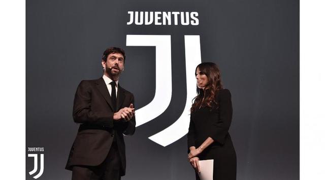
The Juventus President Andrea Agnelli (left) at the launch of the new logo of Juventus.
(dok. Juventus.com)
(dok. Juventus.com)
Turin-Juventus through the official site on Monday (16/1/2017), launching the new logo of the Club. A simple logo with a futuristic touch it began to be used now, but recently plastered on the jersey of the Club began the season 2017-2018.
Simple impression of the new logo is visible from Juventus its only consists of two adjoining the letter J. The letter uses a glowing white was later fitted with the writings of Juventus at the top.
The new logo of course is completely different from the coat of arms of the Club in General. Reportedly, it took about a year to do research and determination of the shape of the logo.
"This is the new Logo of identity from the direction of the life of Juventus. We spent over a year to figure out what the market wanted, but also want to show a sense of ownership and desire for the future, "said the President of Juventus, Andrea Angelli.
"I am also very interested in each time seeing the words beginning with the letter J in the newspaper," he continued.
Simple logo impressed Juventus become the property of modern breakthrough in the world of football. Because, this being a brave breakthrough Juventus eliminates oval logo shape the identity of the Club since 1897. Although simple, the new Juventus logo turned out to be full of meaning and identity will be the spirit of the Club.
"There are no clubs in Europe so far that is able to convey a philosophy like iu. If there are any clubs that are able to do so, it is Juventus. This logo lyrics ambition and excellence of the principles which inspire a unique experience, "said Chief Strategy Officer EMEA, LatAM & Manfredi Ricca, partner companies who designed the logo of Juventus.
Source: Juventus